Cognitive walkthrough, Nielsen's 10 heuristics and user behavior analysis, i.e. about a UX audit.
A UX audit is an expert evaluation of a product or service in terms of user experience. Based on this article you will learn what a UX audit allows to investigate and when it is worth performing one.
What is a UX audit?
A UX audit is a type of a UX expert analysis that allows to detect potential usability problems on a website or in an application (if we're talking about the web industry) in a relatively quick and inexpensive manner. The very term UX Audit encompasses more than just one specific research method.
The most popular methods for conducting a UX audit are: heuristic analysis, cognitive walkthrough, and user behavior analysis.
Heuristic analysis
A method consisting in checking the website for usability according to good practices and expert knowledge. Many different heuristic analysis lists are currently used: the most popular is Nielsen's 10 heuristics created in 1990, which consist of:
Visibility of system status: is the system in which we move responsive to user actions?
Compatibility of the system with the real world: is the system understandable for the user? Is logic and style of communication maintained?
User control and freedom: are system functions well described and positioned in an intuitive way? The user should feel that he is in control of the system.
Consistency and standardization: the system should have consistent communication that is understandable and predictable to the user.
Error prevention: the system should have appropriate mechanisms to minimize the possibility of user error.
Don't force memorization: it is better to store information in the system or to reduce to an essential minimum the places where the user has to provide information from memory.
Flexibility and efficiency: the system should help the user to perform the task in an efficient way.
Minimalism in design: the interface should not distract the user, especially in case of important decisions such as order finalization.
Helping users out of problematic situations: are error messages sufficiently understandable and do they help the user solve the problem?
Help and documentation: systems should have documentation and help pages for users. Especially more complex tools like CRM systems.
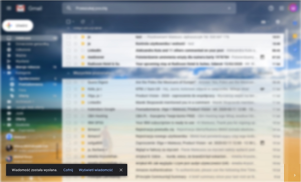
An example of Nielsen's 3rd heuristic: “User Control and Freedom”. After sending the message, the user still has time to withdraw it quickly (window in the lower left corner).
A cognitive walkthrough
The method involves evaluating a website or application from a point of view taking account of new users. It also assumes that most new users learn a new system empirically, that is, by testing it in practice, by trial-and-error. The role of the UX Designer is to step into the role of such a user and walk through a predefined path. For more complex scenarios, a user path map divided into smaller tasks is created.
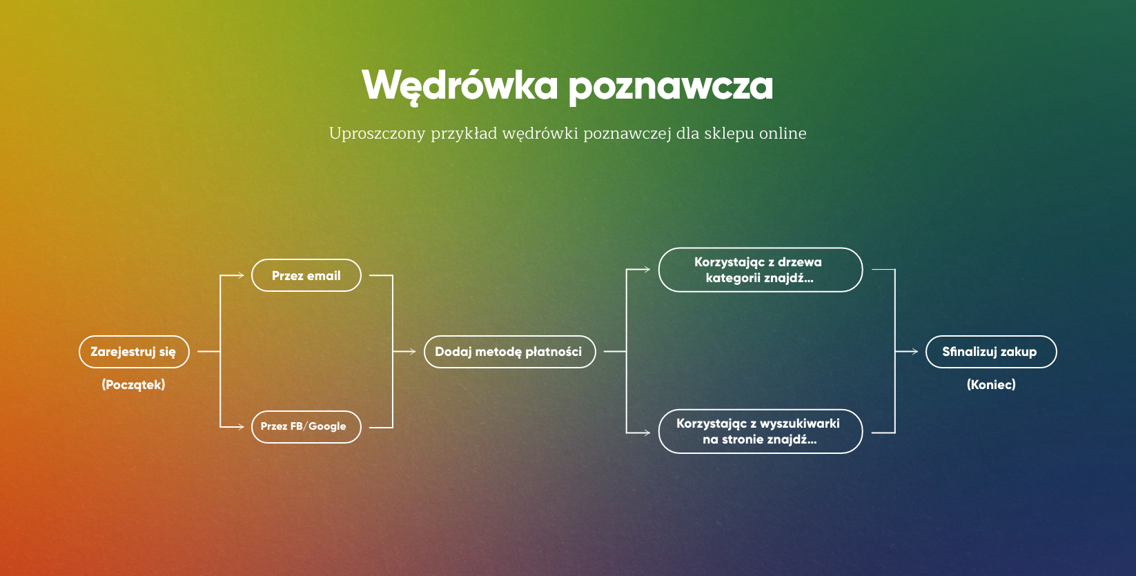
Uproszczony plan wędrówki poznawczej.
A cognitive walkthrough
Simplified example of a cognitive walkthrough for an online store
Register (Start)
By email / By Fb/ by Google
Add a payment method
Find using the tree category
Use the search engine on the website to find
Finalize purchase (end)
A simplified plan for a cognitive walkthrough.
Often, the researcher uses auxiliary questions during the analysis. The most popular of those questions are those written down by Polson Blackman in 2002 in the “Cognitive walkthrough for the Web” paper:
Link umożliwiający rezygnację z subskrypcji nie spełnia zasad kontrastu i znajduje się w mało dostępnym miejscu (na samym dole).
Is the user, through their own effort, able to achieve the intended effect on the website?
Is the interface understandable enough for the user to be able to decipher the actions available on the site without reading the manual? Are the buttons placed on the website described correctly? Does their view indicate that they are clickable?
Will the user notice the actions necessary to accomplish the intended goal?
It is about an intuitive and understandable layout of possible actions such as buttons or form elements. An example of this may be a situation when we try to unsubscribe from a newsletter: European law enforces the creation of an option to cancel a newsletter subscription; companies must include such an option on the website and in the newsletter. However, the law does not specify the manner of graphical presentation of such an option, which leads to its deliberate concealment, e.g. by very low contrast or a minimum readable font size.
The unsubscribe link doesn't follow the rules of contrast and is placed in a hardly accessible place (at the very bottom).
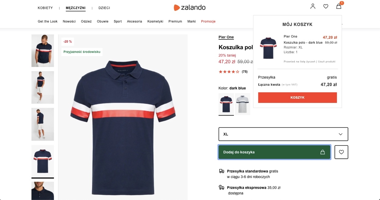
Zalando – after adding a product to the basket, the system immediately informs us about this fact by displaying a special message confirming the action (in the upper right corner).
Analysis of user behaviour
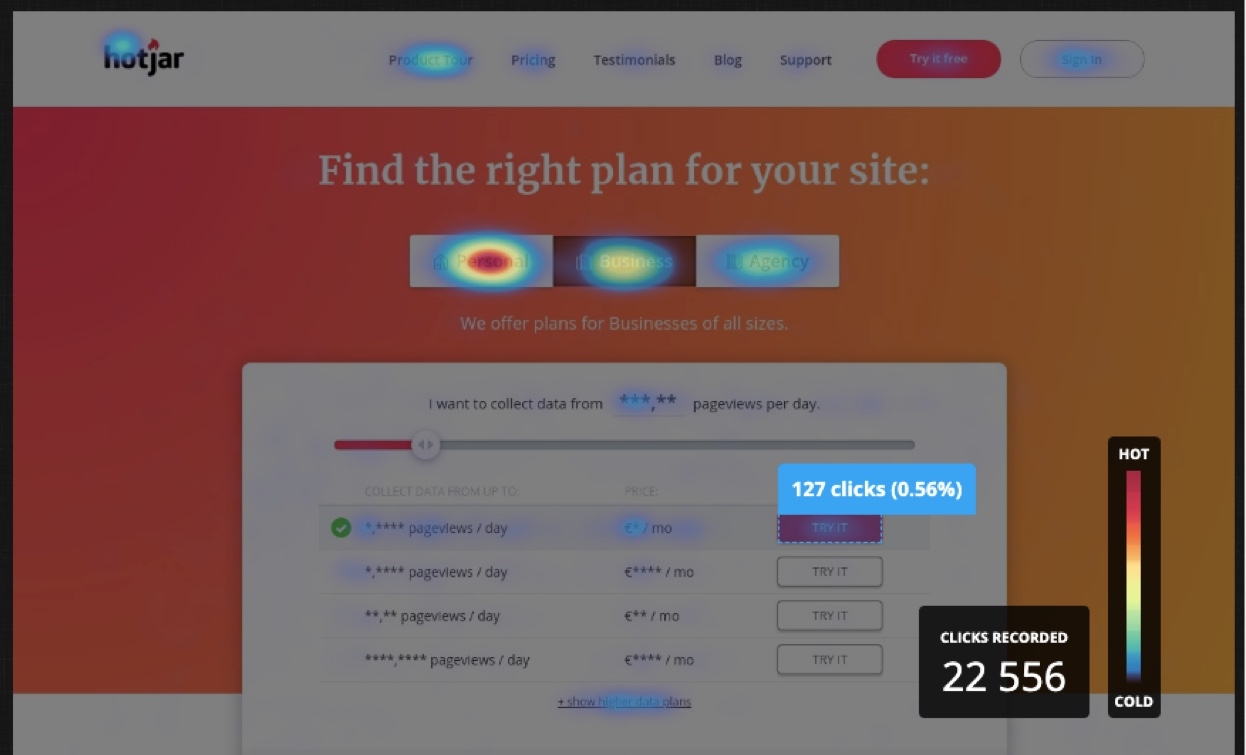
This analysis is based on studying user behavior on the website using programs such as Google Analytics or HotJar. A great advantage of this type of analysis is obtaining quantitative data based on the behavior of real users. The report is created using various tools such as heat maps, recordings of user sessions, and online surveys. The UX expert's job is to uncover recurring patterns and suggest actions aimed at improving the performance. The data obtained in this way are also often the basis for hypotheses, which are then verified directly with users, e.g. during website usability tests.
An example of a “heat map” from www.hotjar.com.
Przykład “mapy ciepła” ze strony www.hotjar.com.
When to commission a UX audit?
An unquestionable advantage of a UX audit is the possibility to conduct it even in a very early phase of the project (the audit can be conducted on the basis of written down functionalities or very preliminary sketches). A UX specialist can evaluate an idea for potential values for users or create initial prototypes quickly, for example in a Design Sprint process.
However, experience shows that clients most often opt for a UX audit:
When there is a sudden or permanent, alarming decrease in KPIs.
This could include a reduced number of orders in an online store, deteriorating reviews of our product, a desire for company employees to use the CRM system more efficiently, or any other indicator important for our business.
When they want to better understand competitors' solutions.
A UX audit based on a competition analysis can be a source of inspiration for the design team and indicate the direction in which the industry is heading.
When there is a lack of funds for user research :)
It will always be better to conduct a UX audit than to start a project without any research or testing. While user research cannot be replaced, the help of an experienced researcher may be the only viable option.
Depending on the type of UX audit and its purpose, the main benefits of the audit are:
Evaluation of a concept or design for usability and functionality,
Detection of potential problem points for users,
Identification of potential opportunities for development.
Summary
Regardless of the research method chosen, the goal of any UX audit is to examine the condition of our website or application. Although a UX expert does not have direct contact with users, the UX audit itself is often the first activity allowing the creation of hypotheses and recommendations and to plan further research.
***
Product Designer by passion and profession. Attempts to merge the world of business and users into one coherent product or service.
K2 Create.
18.03.2020.
Mateusz Jędraszczyk
Product Designer
Product Designer z zamiłowania i zawodu. Stara się łączyć świat biznesu i użytkownika w jeden spójny produkt lub usługę.